Knit People -
Performance Feature

Knit People is a web platform that helps small-medium sized businesses manage and run their HR and payroll processes.
Project Overview
As Knit shifted its business focus to target larger companies, an employee performance review feature became highly requested from both existing and prospective customers. Existing solutions were either too complex and tedious, or too simple.

I worked with our product manager and developers over the course of 5 months to create a customizable, goal-based performance review that would support a variety of organizational structures.
View product page
Impact
The launch of this feature led to our sales team closing sales from larger companies interested in incorporating a digital performance feature into their HR toolkit.
My Role

Product Development

Project Scope

User research, user flows, wireframing, user testing, prototyping, QA.
The Challenge
HR Professionals of medium-sized business are looking for a less tedious and more time-saving solution for employee performance management.
Researching the Performance Management Space
Working together with the product manager, we interviewed our existing and prospective customers about their performance management process and goals. We wanted to know who these people were and what kept them up at night.

I then synthesized our research data and common practises and pain points of our core user: HR Professionals of medium-sized companies.

Four key findings of our core user:

1

They're doing a lot of laborious and time-sucking manual tracking. (Using spreadsheets and follow-up emails)

2

Existing performance review software is either too simple or too ridged (no customization).

3

Every company's org structure is unique. No one-size-fits-all in terms of reporting lines.

4

A company could have multiple types of performance reviews, depending on the type of employee. Ex. Full-time vs contract workers

Identifying User Needs
Based on our research and analysis of HR Professionals, I knew that the process of setting up a performance review had to be as simple and painless as possible, yet still customizable to support different organizational structures.

So I laid out the following requirements:

A Linear Experience

Customization

Notifications

Users should move linearly:
The process of creating a performance review had to be step-by-step, which would minimize the chance of getting lost within an array of sections.

Customization is a must:
Different companies will conduct their reviews based on their unique organizational structures, thus it is necessary to allow for customization at every step.

Notifications required:
Performance reviews run over the span of months, so a notification system is needed to notify users when an action is required, instead of relying on the admin to manually remind people of deadlines.

Creating Information Architecture & User Flows
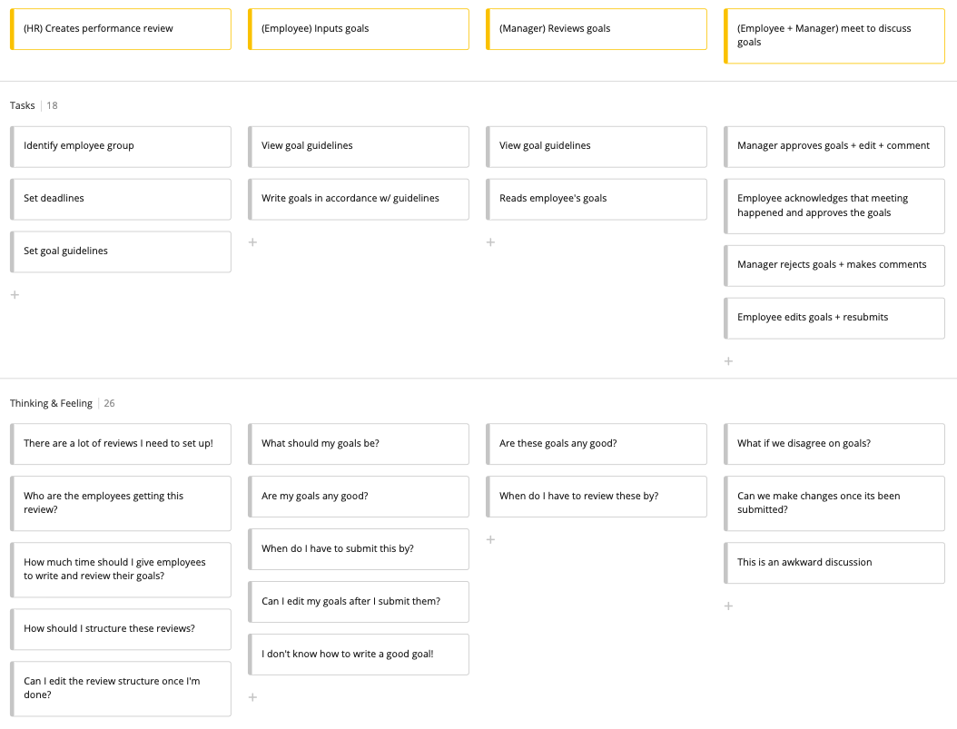
Working with the product manager, we mapped the customer journey to highlight key activities, and to better understand pain points.

Below: User Journey Map

Even though there are many ways to conduct performance reviews, we decided to design a goal-based system, as some of our customers were already using a variation of goal-setting, and many customers wished to transition to this type of review. Our system would allow for recurring reviews, and be fully customizable to support varying team structures.

Since our users wanted a goal-based performance review, we realized that the feature would consist of five main user flows:
  1. Admin sets up the review and its guidelines
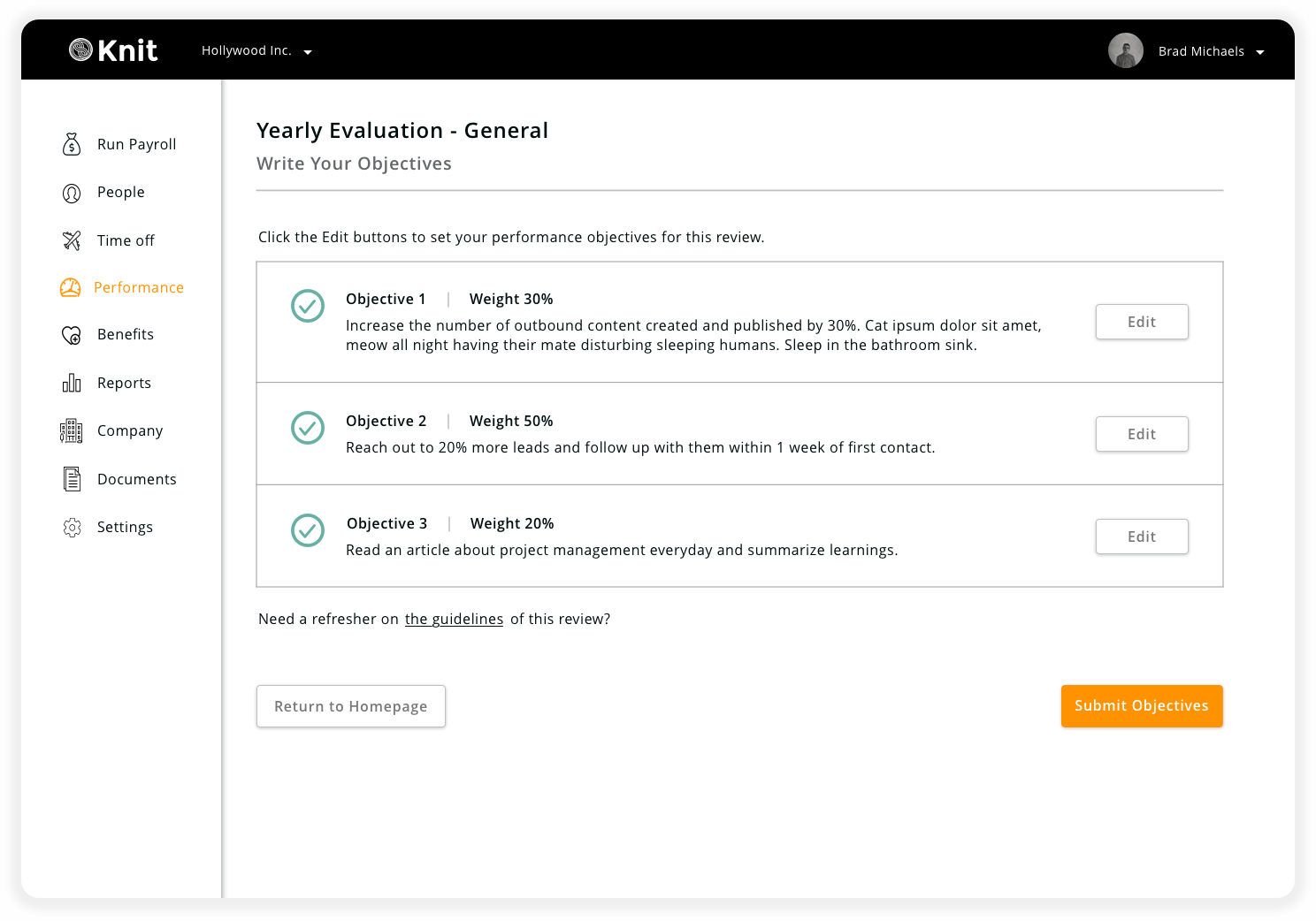
  2. Employee writes their performance goals/objectives
  3. Reviewer reviews and approves employee goals/objectives
  4. Employee write their performance review
  5. Reviewer writes performance review for their employee

Below: User flow #2 - Employee writes performance objectives

Below: Wireframes presented to developers to verify feasibility and difficulty
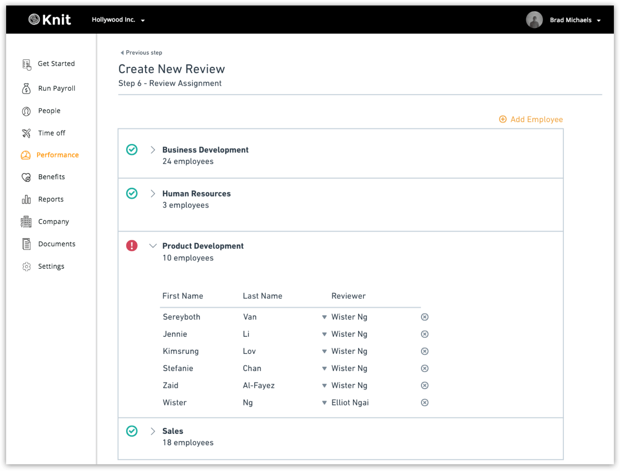
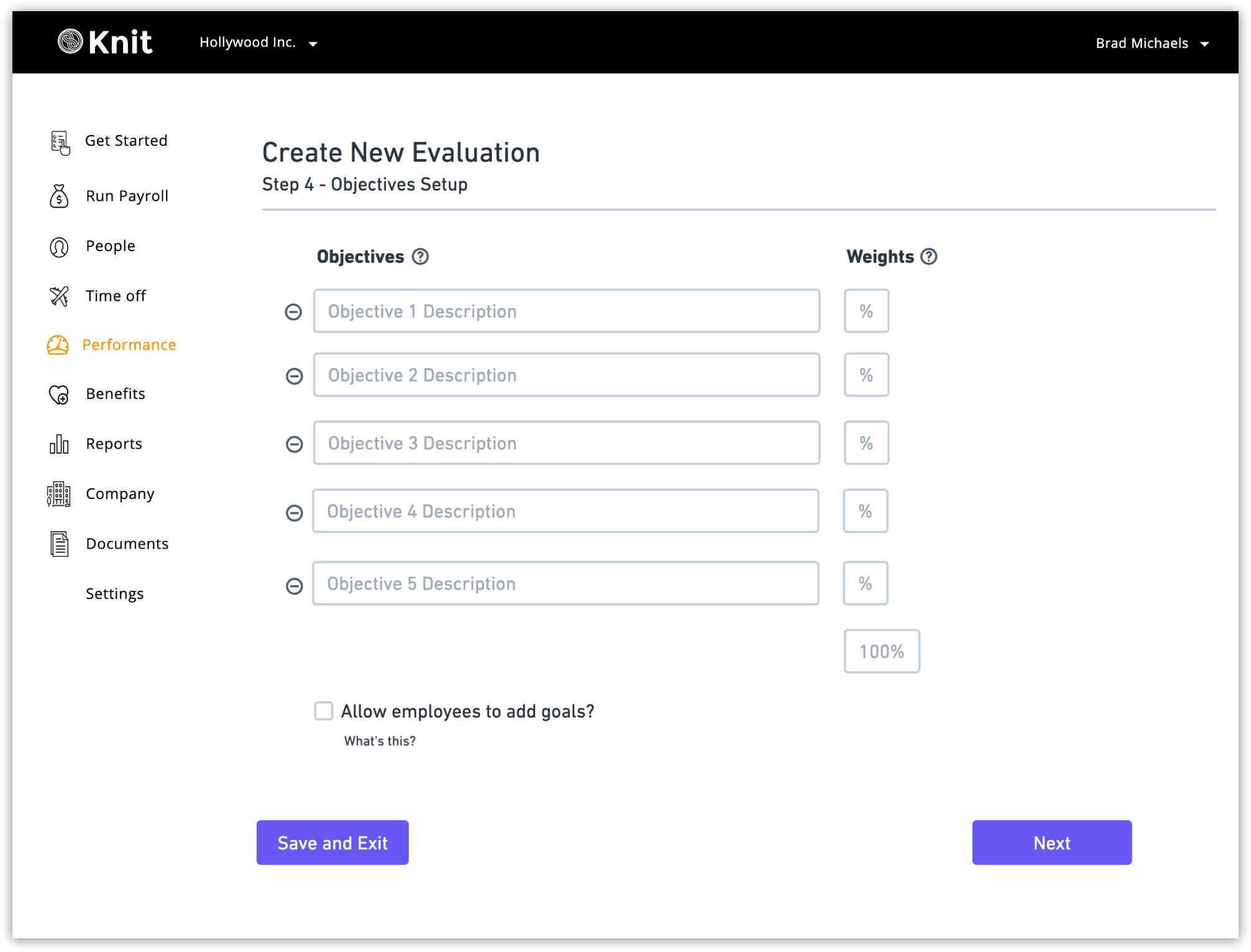
Wireframing for high levels of customization
When creating wireframes, most of the challenges I faced were based around organizing large amounts of customizable data. Some of these challenges were:
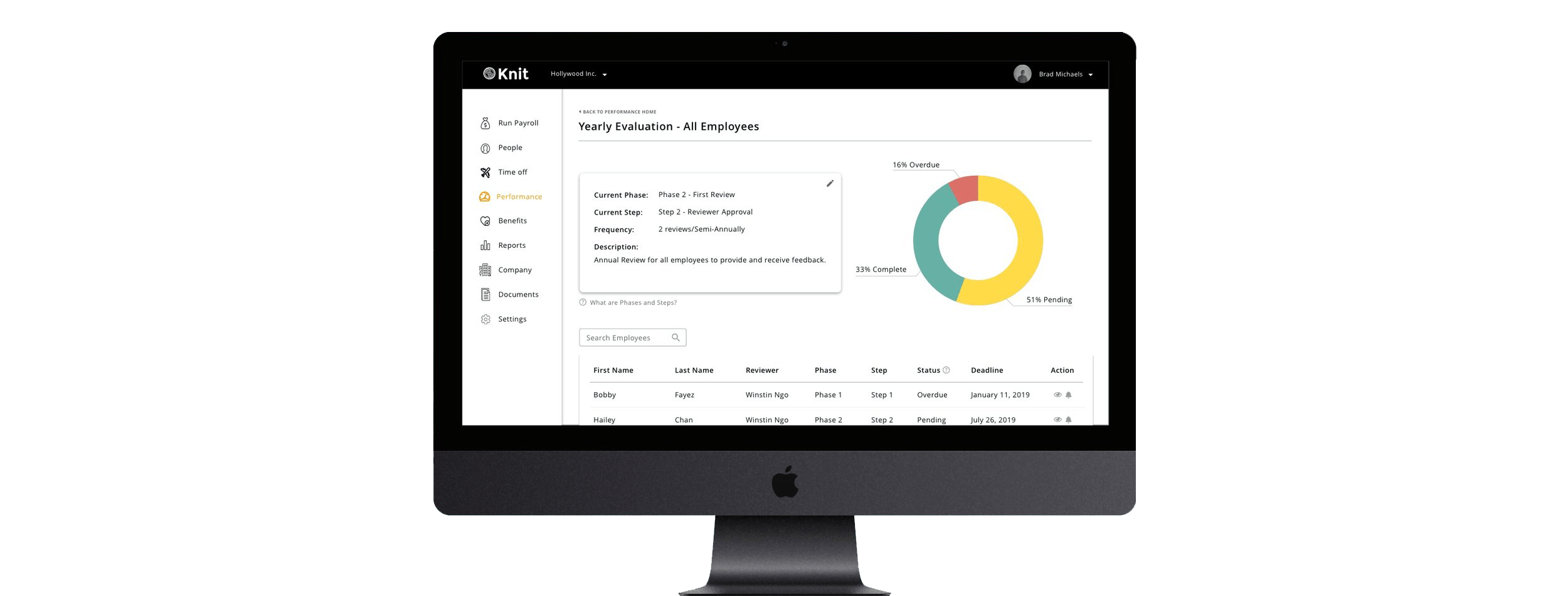
  • How will timelines and due dates be displayed to allow for easy selection and visualization?
  • Within the timeline, how will the admin track who has completed their tasks, and how will the employees know when they need to complete a review?
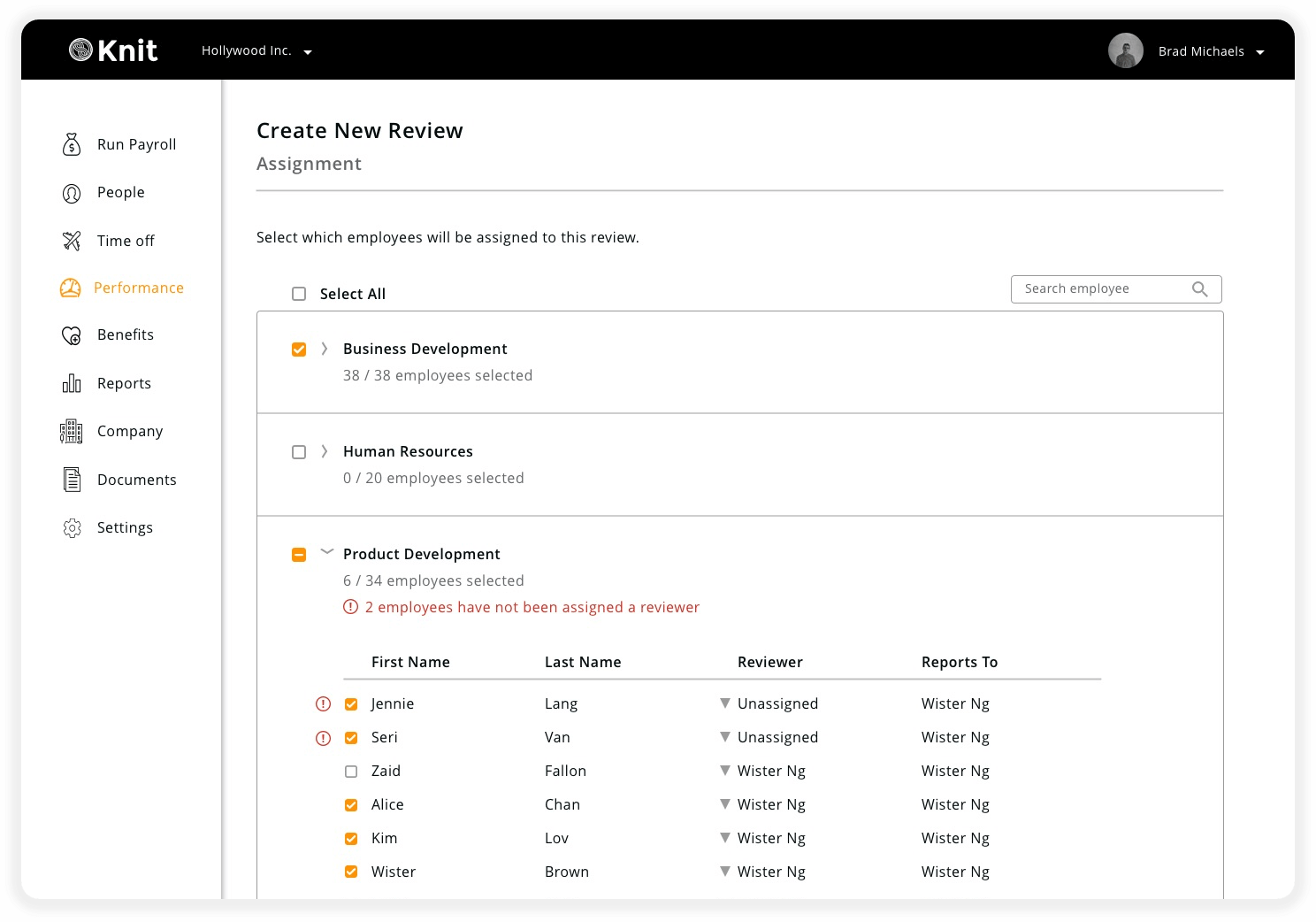
  • How should employee names be organized and displayed so that they can be easily selected and assigned to a reviewer?
Once wireframes for the main screen were established, I presented them to our developers in order to validate the user flow logic, verify technical feasibility, and to get a gauge on the development difficulty.
User Testing: Round 1
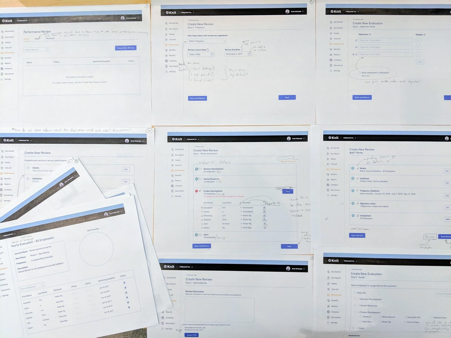
For this first round of user testing, I printed out a set of the wireframes and had HR managers "click" through the paper prototype and recorded their actions and musings as they went through the process of setting up a performance review.

Below: Paper wireframes for prototype testing with users
Testing Key Takeaways:

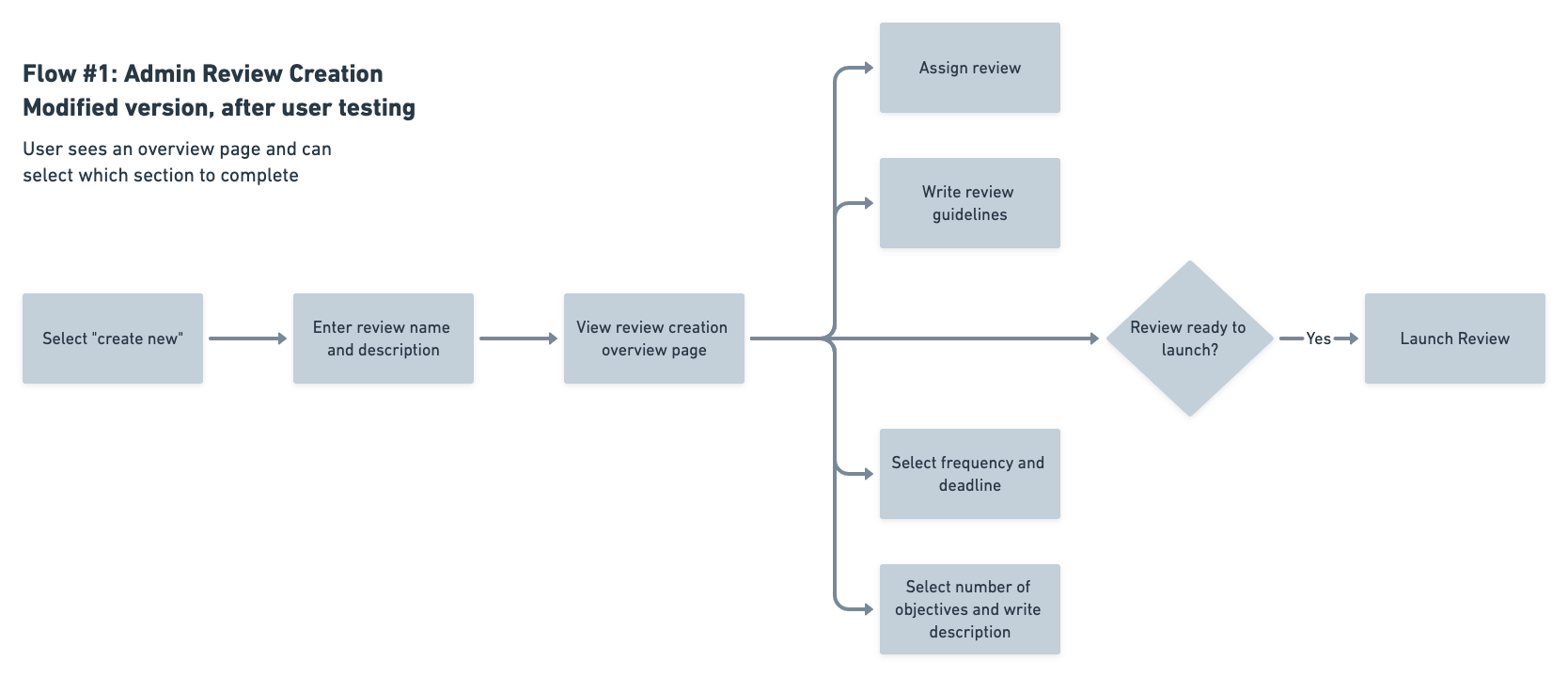
I previously assumed that the review creation should be a linear path in order to cut down on the overwhelming nature of the review. However, I discovered that admins actually prefer the opposite.

They prefer to see all the steps in the review creation and then select which section they want to edit. Otherwise it was "like trying to build a puzzle without having any idea of what the final image is suppose to look like".

Since each section is quite involved, this would allow the admin to create the review based on what information they had available.

"[This user flow is] like trying to build a puzzle without having any idea of what the final image is suppose to look like."

-HR Manager during user testing

Below: After user testing, I modified the main flow so that users could get a better understanding of how the various sections of the performance review fit together.

Going Hi-Fidelity & Hand-Off
After making changes to the wireframes based on testing feedback, I developed hi-fidelity screens and worked with our developers to ensure a mutual understanding of product architecture and interactions.

Below: Hi-fidelity screens

Road Blocks & Reflections
The people we interviewed during initial research wanted a lot.

But we could not build everything for them in the available time.

It was difficult to distill all the wants down into the core necessities and decide what features made it to the our minimal viable product, and what could wait until a later version. There was always someone on my team yelling “scope creep!” or “V2!”.

There were several features that I was so certain needed to be in V1, but they ended up being cut in later iterations due to time constraints on the development cycle. This taught me that there are always ways to simplify, and to never be too attached to any one feature or design element.

Everything is an assumption until tested.

During this project, I found myself jumping to conclusions and solutions a lot. If I were to redo this project, I would take more time brainstorming and researching a larger variety of ideas, instead of succumbing to the pressures of a time crunch and jumping so quickly into a solution. I would also spend more time tracking my assumptions and trying to identify and validate them before getting too deep into the solution.

The be-all, end-all performance platform was not possible.

At first, we wanted to give employees and reviewers the ability to do everything in our feature, even facilitating discussion. However, after much brainstorming and many failed designs, my product manager and I realized that allowing reviewers and employees to pass comments and edits back and forth made the design unnecessarily complicated.

We realized that face-to-face time was the most effective way for employees and their reviewers to discuss and learn from performance reviews. After all, performance is a very personal subject matter. So we only gave reviewers the option to approve objectives on the platform, and instead added copy that encouraged employees and reviewers to discuss the review offline, as sometimes the best solution is a tried and true offline solution.